
engineering
Why We Care What the Docs Look Like
Good-looking documentation should come with the tool. A closer look at typography, API references and the design choices projects make with Sourcey.
A beautiful documentation site should not require a second frontend project.
You already have a product to build. Its API lives in a spec, its library reference lives in code comments, and its guides live in Markdown. Getting those things onto the web should leave you with something you are proud to put your name on: sharp typography, proper code treatment, fast ways into the reference, and a design that feels like your product.
That is a big part of why we build Sourcey. It takes the material you already maintain and turns it into a documentation site you own. The generated reference gets the same attention as the hand-written pages. You can give the site its own identity without taking on the job of maintaining a custom docs frontend.
Look at the difference between an email platform’s working manual, a dense API reference, and a protocol specification. Each asks something different of the design. A few examples make those choices easier to see.
The guide and the API belong together
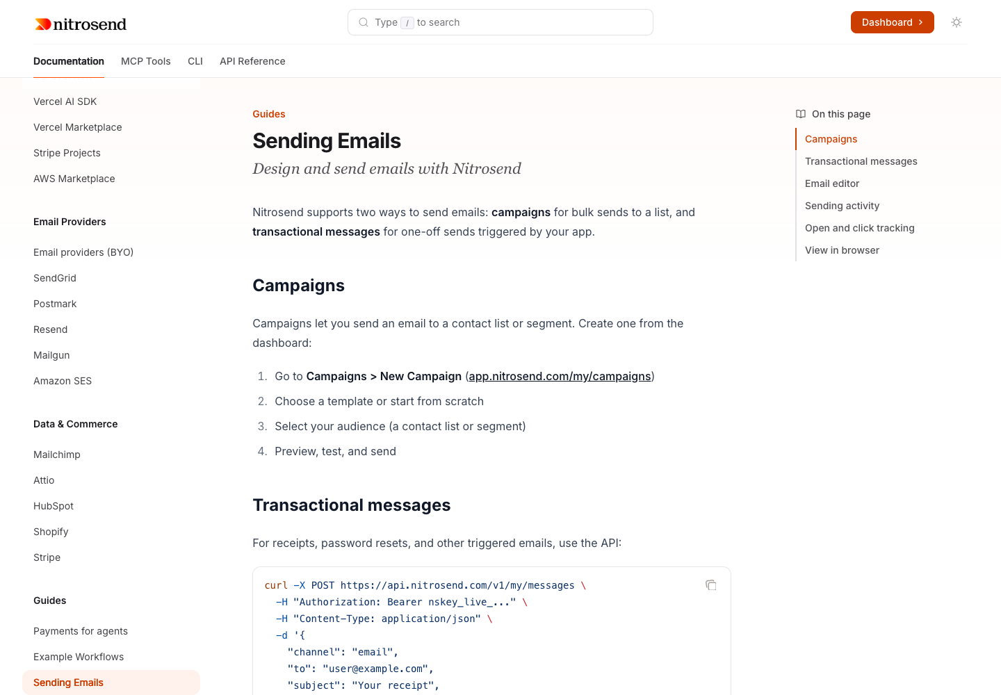
Nitrosend’s sending guide starts with work someone actually wants to do: send an email. A campaign needs a sequence of dashboard steps. A transactional message needs a request example. The page gives each enough room, with numbered instructions for one and code for the other.
Documentation, MCP Tools, CLI, and API Reference sit in the same navigation. A developer can move from the explanation to the interface they intend to use without leaving the product’s docs for a differently styled reference site.
That continuity is easy to undervalue when building a docs system one page at a time. The reader experiences the whole trip. They might arrive through a guide, check a field in the reference, and come back to finish the example. The typography, navigation, and language should still feel familiar when they return.
Nitrosend’s orange accents, wordmark, and page structure give that trip a recognisable home. You don’t need to make the search box mysterious to make the product memorable.
Let a reference be a reference
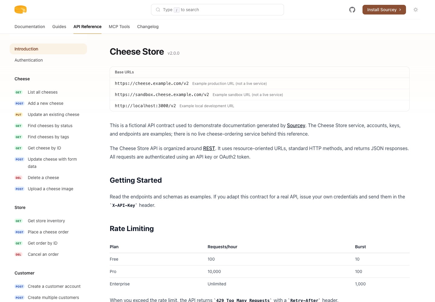
The Cheesestore demo is cheerfully full of cheese. It is also a proper API reference: methods, operations, schemas, parameters, examples, and links between them.
Those details need space. A developer looking up an endpoint is often scanning rather than reading from the top. Method badges help distinguish GET from POST. The operation list gives them a route into the API. Schemas and examples need enough width to remain legible without turning every field description into a tall, narrow column.
An API reference laid out like an essay makes the reader keep scrolling for information that belongs together. An essay laid out like an API reference is exhausting in the opposite direction. Sourcey’s presentation has to accommodate both.
Cheesestore is a fictional service, so you can inspect its OpenAPI source, follow it into the rendered reference, and try the documentation setup without needing a customer account. It is there to be taken apart. Change a description, rebuild, and see where the change lands.
The personality is deliberate too. Technical documentation can be precise without looking like the author has been punished for having a sense of humour.
A specification can feel like a publication
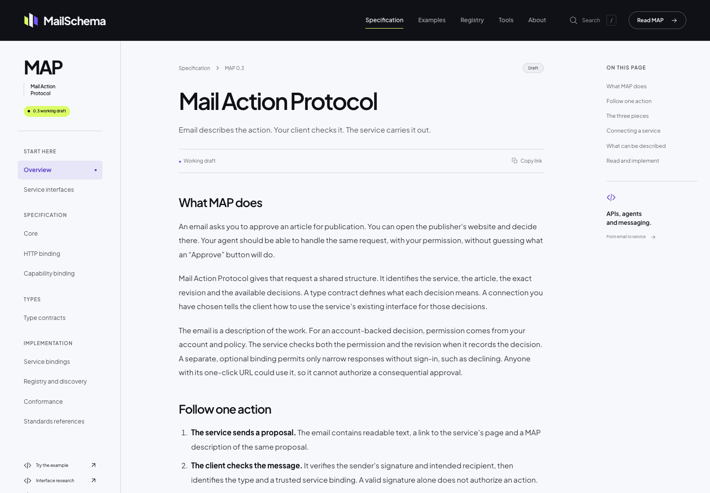
MailSchema uses Sourcey’s reader layout for a much longer encounter with the material. Its specification needs a sequence, a hierarchy, and room to explain how the protocol works. Someone may be reading an entire section before jumping to a type definition.
The dark masthead, project typeface, and purple and lime details give it a distinct identity. The central reading column is calmer. Chapter navigation and links into the current section let you move around without losing the document’s structure.
The version and working-draft status are visible where an implementer needs them. Those labels affect how someone reads the specification. They deserve to be part of the design, with enough prominence to survive a visit that starts halfway through the document.
This is the freedom we want projects to have. Use the engine’s reading layout, then make decisions about type, colour, navigation, and emphasis that belong to the material. MailSchema’s fonts and branding live in its project configuration; it does not need to become a separate publishing system to look like itself.
The documentation should demonstrate the tool
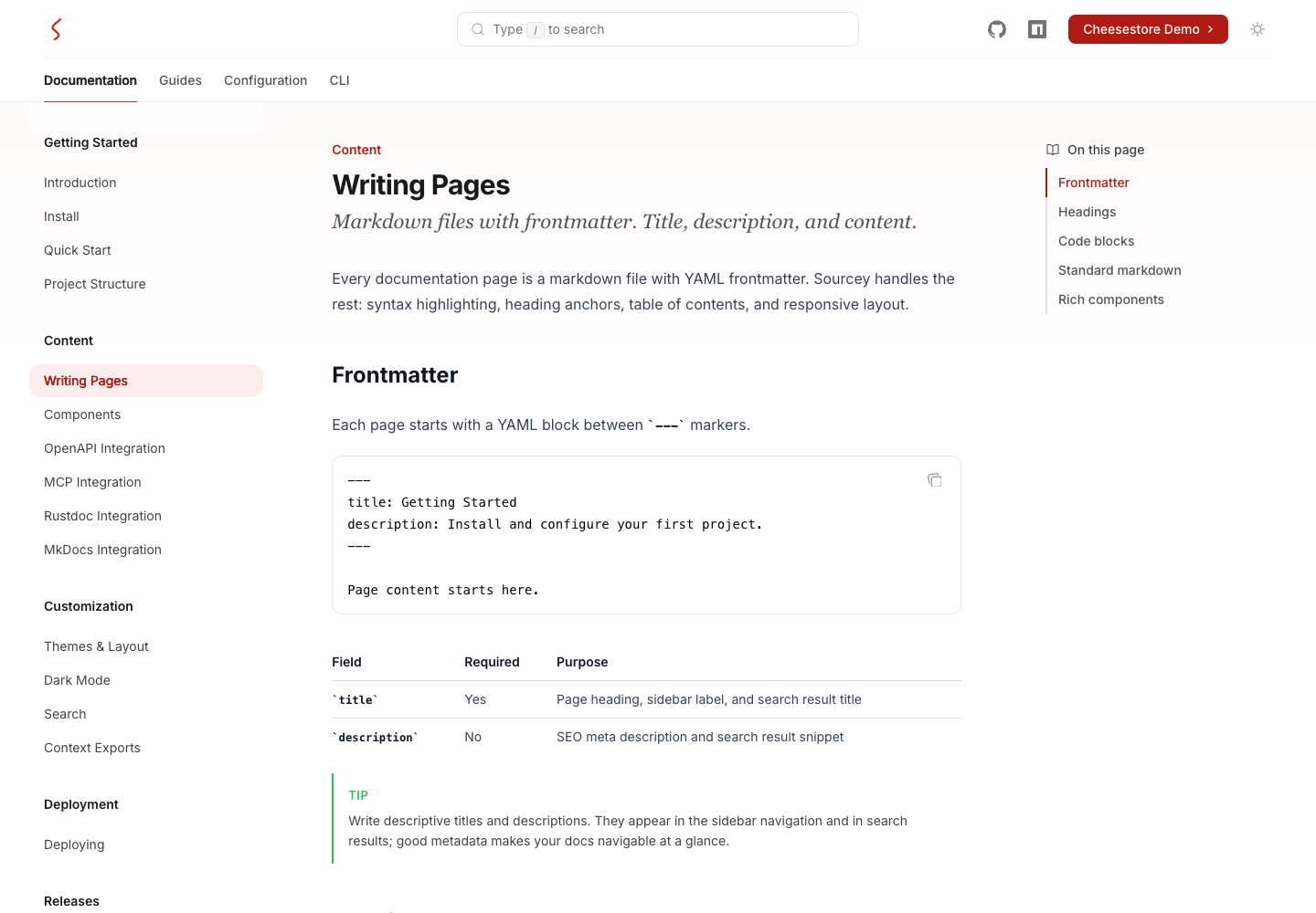
Our Writing Pages guide has a particularly satisfying job. It explains how to make the page you are looking at.
A frontmatter example sits above the table explaining its fields. The heading, description, code block, and callout use the same presentation the reader can publish. You can look at a source choice and its visible result together.
Take the page title. It appears in the heading, navigation, and search result. Keeping those uses connected gives the author one place to make the decision and the reader a consistent name to follow. A handsome page and a coherent publishing system meet in details like that.
The writing still needs judgment. A theme cannot decide whether a new user needs an explanation before an example. It can make the relationship between the two clear once the author has decided what to say.
The design belongs in the project
MailSchema’s font and colour choices are ordinary project configuration. Its reader theme uses locally hosted Plus Jakarta Sans, project CSS, and document metadata drawn from the specification. Those are files the project can review and change, alongside the writing.
That arrangement matters more than a theme picker with a hundred nearly identical presets. A specification may need a prominent draft status and quiet chapter navigation. A product API may need denser reference tables and more room for examples. The same renderer should leave room for both.
Start with an awkward page when shaping the design: the longest method signature, the table with six columns, the warning that takes a paragraph to explain. Give those room to work, then return to the landing page. A docs site should still look like someone cared once you get past the screenshot.
Spend the reader’s attention carefully
A new user and a returning developer need different routes through the same site.
The new user may be working out which interface to use. The returning developer may know exactly which option they need and have no interest in reading the introduction again. Top-level tabs, sidebar groups, page outlines, and search handle different parts of that problem.
This is where restraint earns its place. A navigation label such as “API Reference” tells people what is behind it. Making it more inventive rarely helps. The current page should be obvious. The surrounding interface should give a large code example enough room without making ordinary paragraphs span the entire screen.
These choices also create the rhythm of the page. Short instructions can sit close together. A long example needs a pause around it. A warning belongs beside the action it changes. Dense reference material can use more of the available width than a sustained argument.
When those choices work together, a reader can move between prose, code, and reference without continually figuring out how the page is organised. That is as much a part of the visual result as the colour palette.
A phone changes the composition
On a narrow screen, the desktop’s surrounding navigation has to make way for the document. Sourcey and Nitrosend condense it into a compact header and page-location row. MailSchema keeps its protocol context in a different arrangement.
The question is what the reader still needs at that width. They need to know where they are, reach another page, and read the current one. A long code line remains a long code line. A table still has relationships across its columns. Giving those elements their own space is better than squeezing them until neither is readable.
We use populated pages to judge the design because real content makes demands an empty template never will: long names, nested types, examples with setup, a warning halfway down a page. Those are the things people will spend time with after the opening screen.
Keep it looking good when the project grows
A one-off page is easy to art-direct. Documentation has to survive the next release.
Sourcey brings authored pages and generated references into the same site. Nitrosend combines its guides with MCP and OpenAPI inputs. Our own docs are published under /docs/. A specification such as MailSchema keeps its navigation, typography, and branding with the project. Those choices belong alongside the sources that produce the pages.
When an interface changes, you should be able to update the owning spec or comment and rebuild. When a guide changes, it should inherit the same presentation as the pages around it. Adding a new section should not mean designing its typography and navigation from scratch.
Start with a guide and a piece of reference from your own project. Put them in Sourcey, give them your branding, and follow the links between them. The authoring guide covers the pages; the Cheesestore repository gives you a complete site to build and change.